How I Keep Consistent Colour in my Commercial Photography
When producing advertising or marketing campaigns it is often important to my clients that they can keep consistent colour throughout. If you shoot images in varying conditions with different lighting then the colour won’t appear to be consistently accurate. Different lighting can affect how we perceive colours. For example, tungsten lighting produces a warm glow that makes everything look a bit more orange than usual. So, how can you keep images shot in different lighting from showing divergent colours?

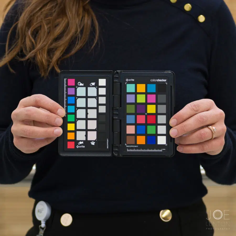
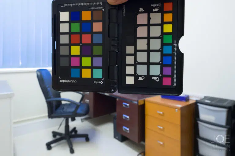
In the image above you can see one of my really important pieces of kit. It is a colour chart that goes with me wherever I am shooting. This colour chart has software that knows precisely what those colours should look like. So, if I have a photo of the chart where I’m working, the software can adjust it until the colours are as they should be. I can then apply these settings to the images I shoot so that they are all adjusted to the correct colour.
There are various options available for colour calibration. I use the “Color Checker Passport” from X-Rite. My monitor has a wide colour gamut, meaning that it can show a wide range of colours. It is also calibrated to ensure that those colours look the way they should. So, when I bring up images on my computer and calibrate them using the software that comes with the chart I can see consistent colour that I know is highly accurate.

When I send files to customers they can be set so that the colours are reproduced accurately online. For this I export images to the sRGB colour space that is used by web browsers. If images are going to be printed then the colours can be set by using Adobe RGB or a customised printer profile from the machine that will be doing the printing. All of these steps work together to ensure that the colours are consistently reliable.
If you need consistent colours for your photos then I would recommend working with a colour chart and a grey card to set white balance. All quality professional commercial photographers should be able to manage colour accurately in their workflow. On occasion for artistic reasons you may wish the colours to be slightly warmer or cooler, for example. However, colour is something that should certainly be under your photographer’s control.
© Joe Lenton, July 2019
