Creative Perfume Images
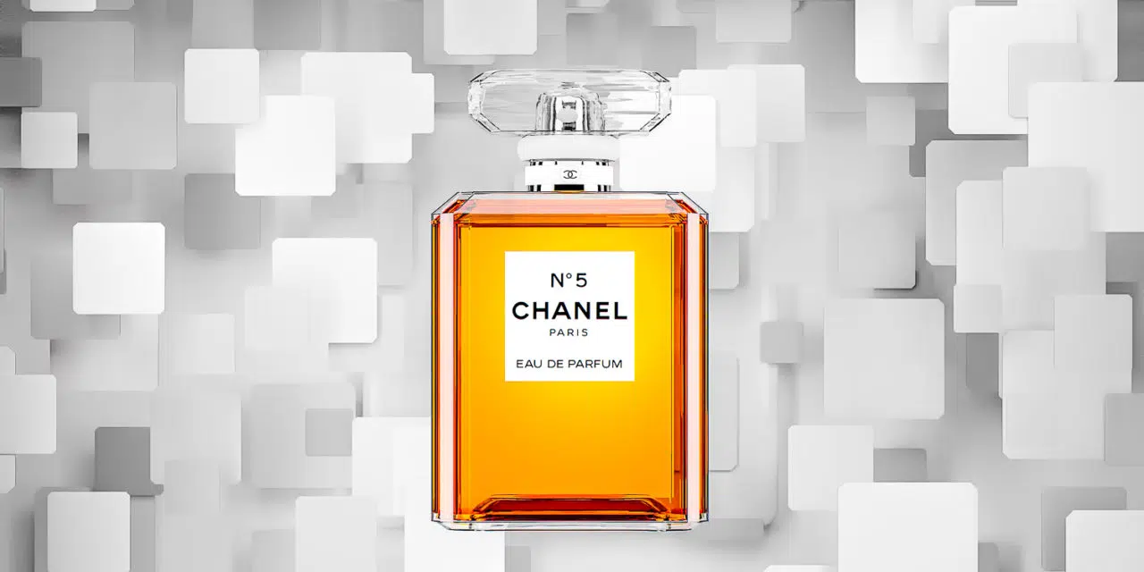
Perfume advertising images have a number of jobs to do. They need to catch your attention somehow. The product needs to be the main focus or “hero” of the shot. Assuming we are talking about a luxury product, it can be helpful to have a strong sense of design so it has a luxury feel. One further consideration is whether we want to make it feel slightly out of reach – desirable, but not attainable by all. I created the series of images you see on this page as a case study on Chanel No 5 perfume.
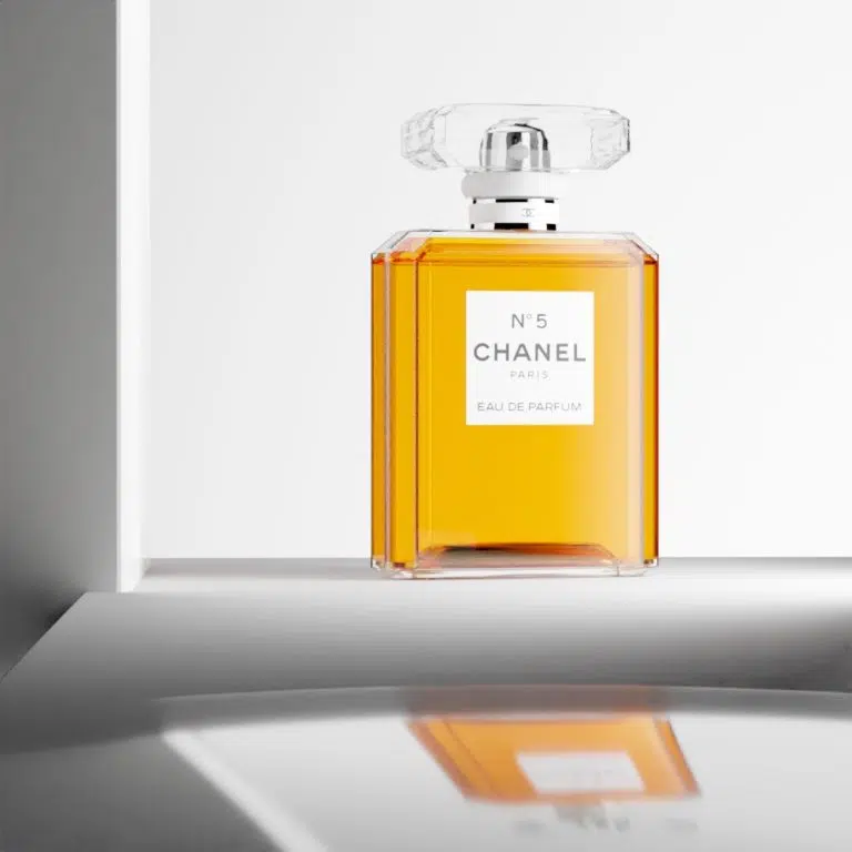
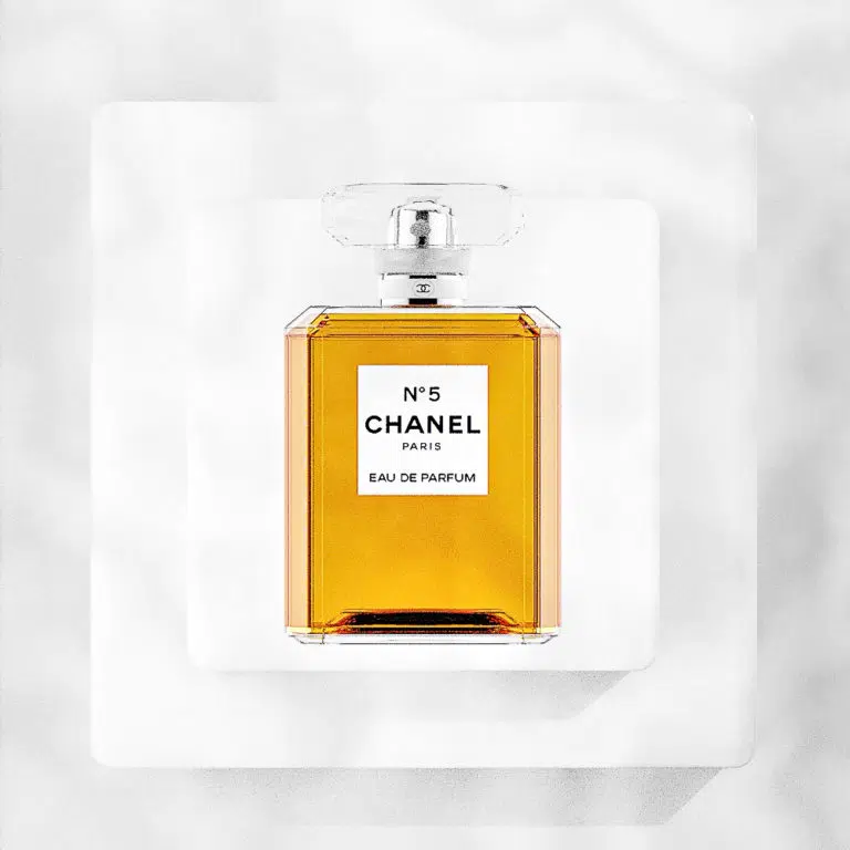
Strong geometric shapes often feature in modern high end product images. The bottle is an iconic item in itself and has a strong geometric look to it. So, I looked for ways to use this in the images. I felt that the image at the top of the page was one of the strongest of the group. It uses smaller geometric shapes that take their cue from the bottle. They, like several of the other background sets are monochrome. This allows the bright colour of the perfume to be the clear, obvious focus of the advert.
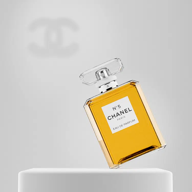
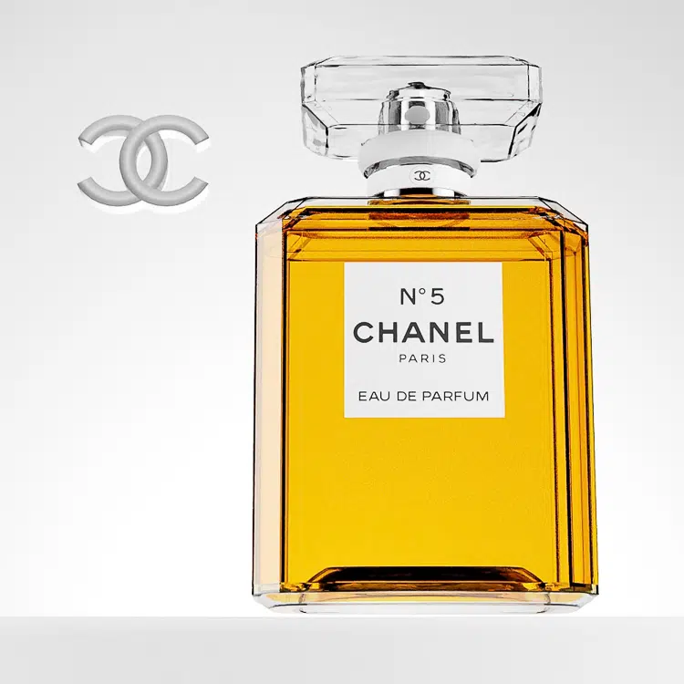
The above 2 images make use of the Chanel logo in different forms. They provide interesting alternatives, but with a product like this I’m not sure that the logo would really be needed or all that helpful.
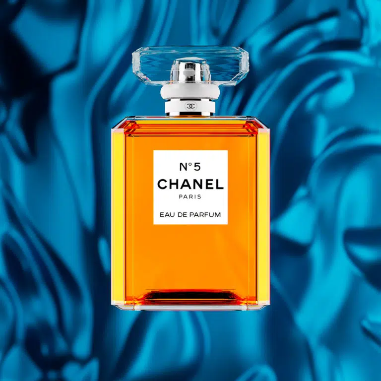
This image uses a complementary colour (blue) to help the colour of the perfume to stand out. The background is based on silk. It was chosen to add to the luxury feel of the product as silk isn’t a cheap material.
It draws on both design concepts and lifestyle association to make the product clearly visible and to add to our subconscious impression of it. In this case the material is CGI, but it could equally have been photographed and combined with the shot of the perfume bottle.
The final picture in this series of perfume advertising images below took inspiration from Greco-Roman architecture and art. The idea was to create a kind of champion’s plinth for the bottle to stand on heroically. The rest of the scene was designed to give the feeling of the product being worthy of spending time finding and obtaining. It is a bit like a hidden cave that one might need to find on a quest and the island separated off by water isn’t obvious how to get to. Finally, the light blue was used as a complementary colour to the perfume to give a sense of harmony and to show off the golden colour.
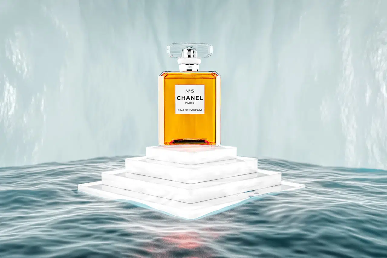
Just because something can seem a good idea doesn’t always mean it will work, however. This final image would be quite a departure for Chanel from their current style so would be unlikely to be accepted. Creative image ideas always need to be tested against the company’s branding and target audience. If it doesn’t fit then it would have to go!
All of the images featured here were created using CGI. Please view more of my CGI product modelling portfolio. You might also like to consider a CGI animation as part of your marketing on social media and your website.
If you are interested in exploring photography options please also take a look at my advertising photography page.
It is my philosophy that images are a powerful form of communication. That is why I like to have a strong rationale behind each image. This gives a much greater chance of the image being successful. Read more about this in my articles on the power of images and communication using images.
Images & text © Joe Lenton, June 2020
